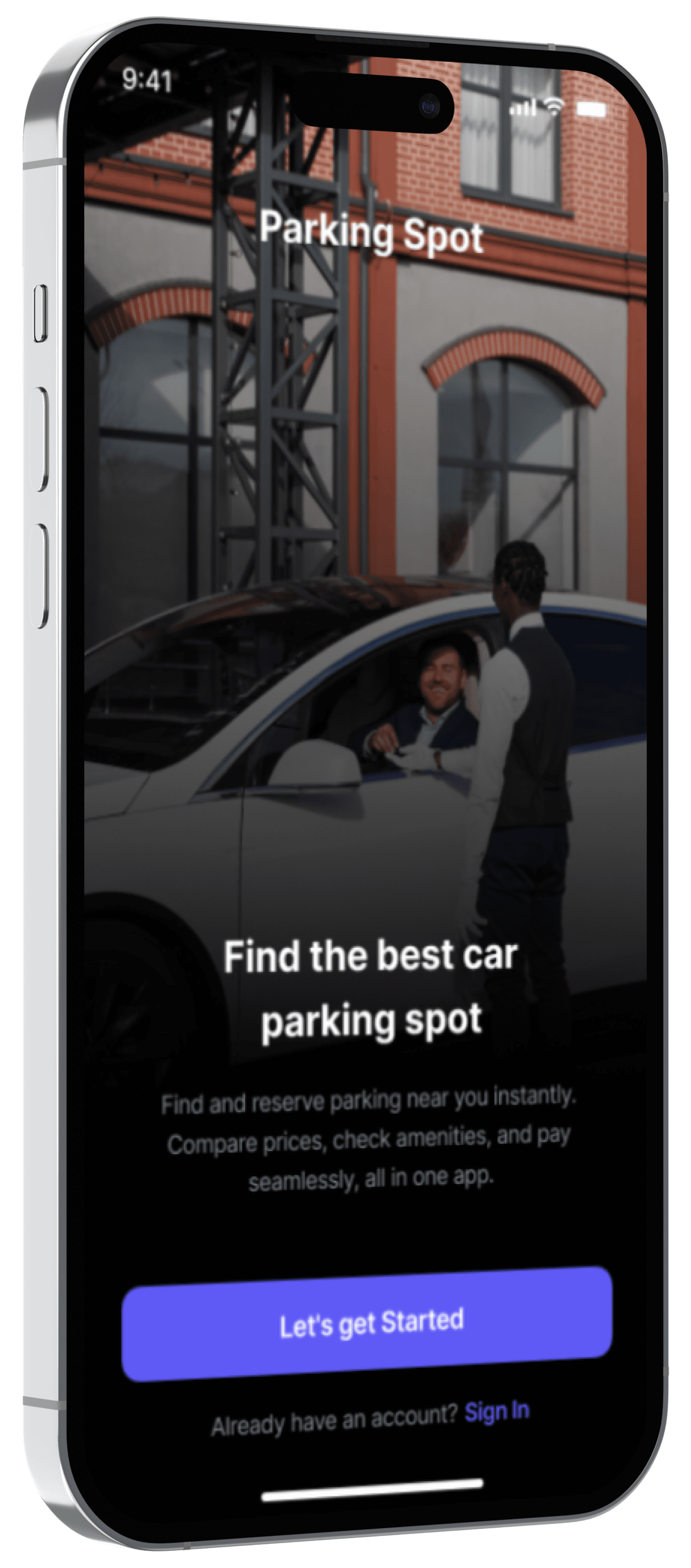
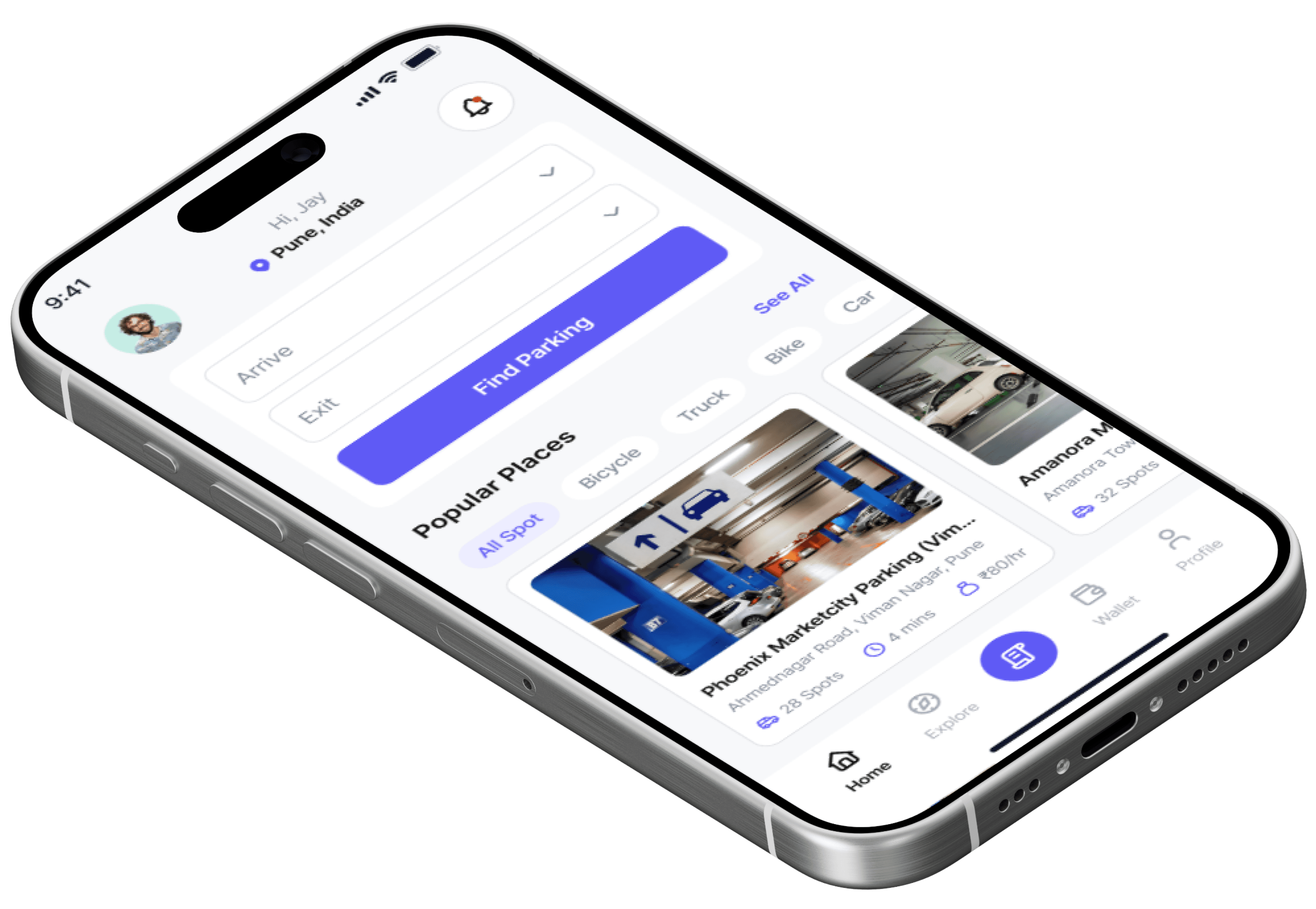
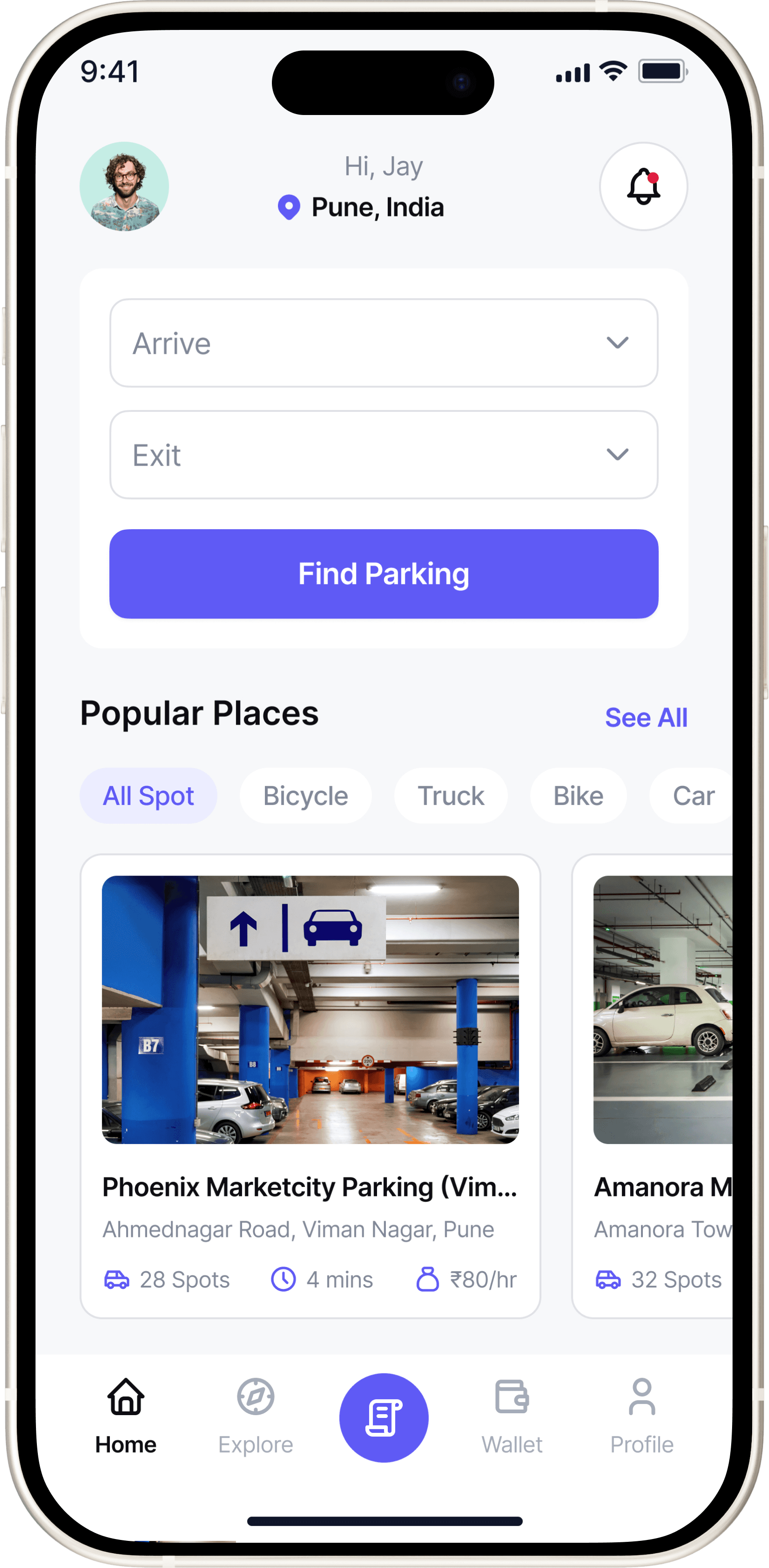
Mobile Application

Parking Spot

Parking Spot

A user-centered parking app that helps drivers find, compare, and reserve parking spots with real-time availability, guided navigation, and secure online payment.

Role

Product Designer

Timeline

6 Weeks

Tools

Figma | Notion | Miro | Google Form

Overview

Parking in cities shouldn’t feel like guesswork. Drivers waste time circling, unsure which lots have space, fair pricing, or safe conditions.


Parking Spot reimagines this daily frustration through a smoother, smarter design helping users find, compare, and book parking in seconds.

Easy slot search & booking

Smarter in-lot navigation

Seamless digital payment

Quick vehicle location recall

Problem

Finding parking shouldn’t feel like a daily challenge yet most drivers describe it as stressful and unpredictable.


Through short interviews with commuters, cab drivers, and office workers, I uncovered five recurring issues.

Wasted Time

Unclear Details

Cash-Only Payments

Poor Navigation

Forgotten Location

MY APPROACH

Research that shaped meaningful design

Research that shaped meaningful design

From user frustration to clarity, each step in my process aimed to make parking predictable and stress-free.

Analyzed 3 leading parking apps to spot usability gaps.


Most lacked real-time updates, transparency, and payment options.

3 Apps Audited

Competitive analysis

Analyzed 3 leading parking apps to spot usability gaps.


Most lacked real-time updates, transparency, and payment options.

3 Apps Audited

Competitive analysis

Conducted 6 interviews with commuters, cab drivers, and office workers.


Mapped their daily challenges with finding, paying for, and remembering parking spots

6 Users • 3 Personas

Understanding the Driver

Conducted 6 interviews with commuters, cab drivers, and office workers.


Mapped their daily challenges with finding, paying for, and remembering parking spots

6 Users • 3 Personas

Understanding the Driver

Grouped all insights into 5 key pain points.


Focused on transparency, navigation clarity, and trust.

5 Core Problems Identified

Finding patterns that matter

Grouped all insights into 5 key pain points.


Focused on transparency, navigation clarity, and trust.

5 Core Problems Identified

Finding patterns that matter

Competitive Analysis

Finding the Gap Between Booking and Navigation

Finding the Gap Between Booking and Navigation

Understanding where competitors fall short helped me identify opportunities to simplify booking and enhance in-lot navigation.
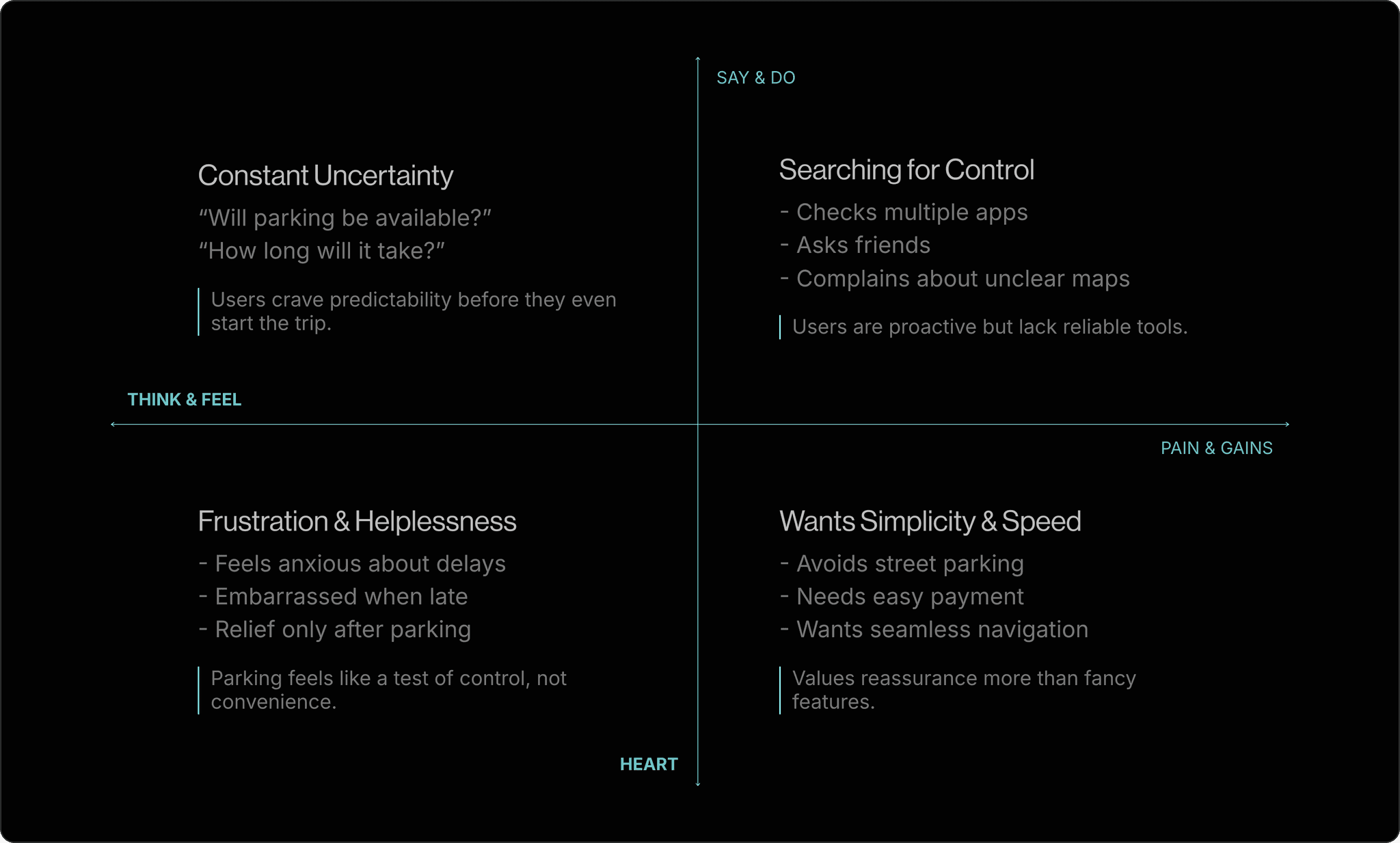
Competitor 1

Competitor 2

Competitor 3

Strengths

Fast booking flow

Multiple parking types

Real-time data

Weaknesses

No navigation aid

Lacks route saving

Complex UI

Competitor 2

Strengths

Weaknesses

Competitor 1

Competitor 2

Competitor 3

Fast booking flow

Multiple parking types

Real-time data

No navigation aid

Lacks route saving

Complex UI

No platform offered a seamless flow from booking to real-time navigation within the parking lot. This became the core problem I chose to solve.

Empathy Map

Stepping Into the Driver’s Mind

Stepping Into the Driver’s Mind

After identifying key pain points, I mapped how drivers think, feel, say, and act when finding parking. This helped me uncover emotional triggers behind their frustration and design for real-world stress.

User Journey

Tracing the Parking Experience

Tracing the Parking Experience

Mapped the entire parking journey, from searching to booking to parking, to identify emotional friction points and design smoother, stress-free transitions.
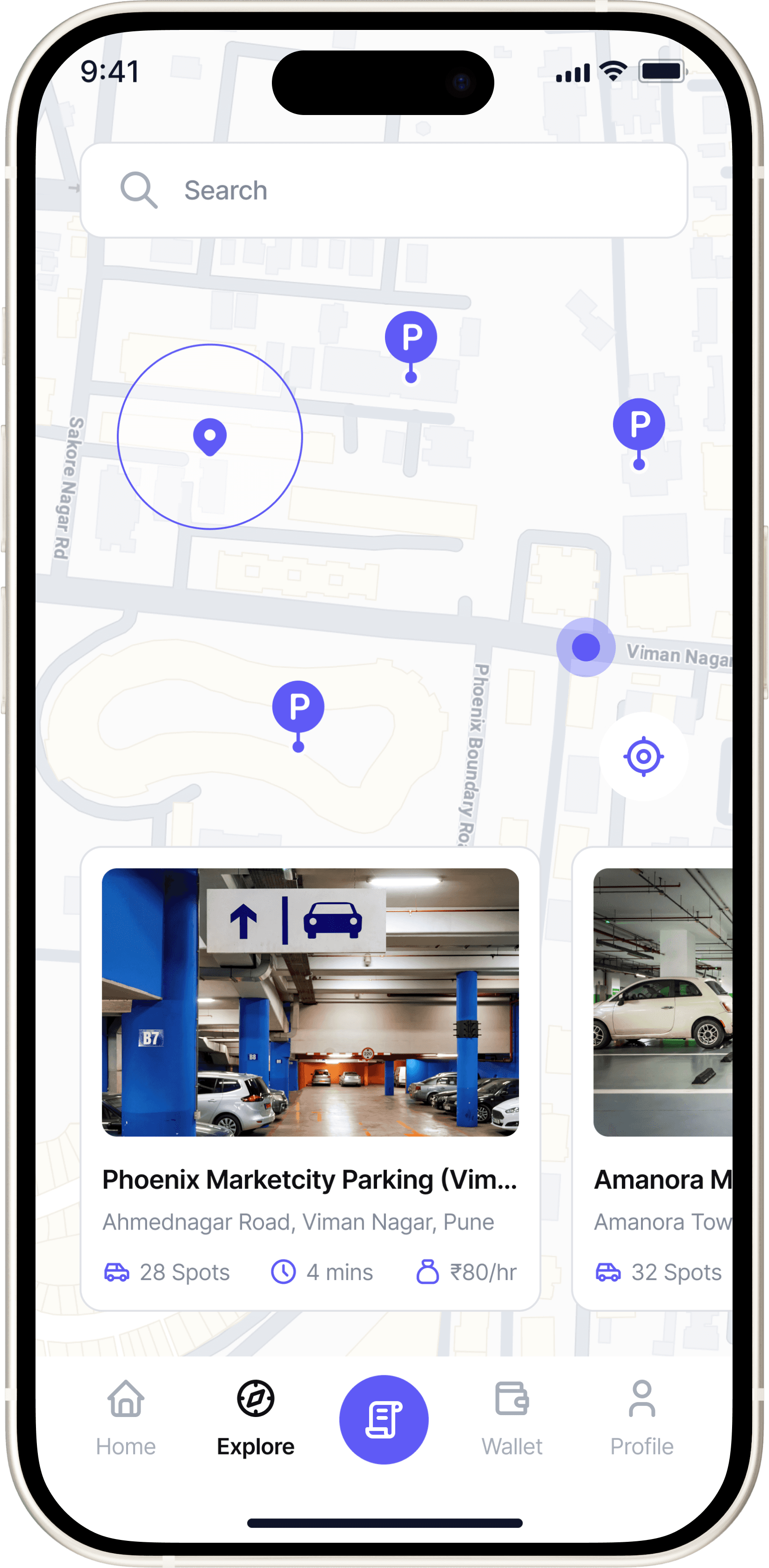
After analyzing the research data, I grouped recurring frustrations into five key pain points. These challenges became the foundation of my design, each one addressing a specific friction in the driver’s experience.

After analyzing the research data, I grouped recurring frustrations into five key pain points. These challenges became the foundation of my design, each one addressing a specific friction in the driver’s experience.

Problem → Solution Walkthrough

Problem → Solution Walkthrough

#1 Wasted Time Searching

#1 Wasted Time Searching

“I usually spend 10–15 minutes circling before I find a spot.”

“Google Maps shows nearby lots, but not if they actually have space.”

“Even if I find one, it’s full by the time I reach there.”

Office Commuter

“I usually spend 10–15 minutes circling before I find a spot.”

“Google Maps shows nearby lots, but not if they actually have space.”

“Even if I find one, it’s full by the time I reach there.”

Office Commuter

Design Objective

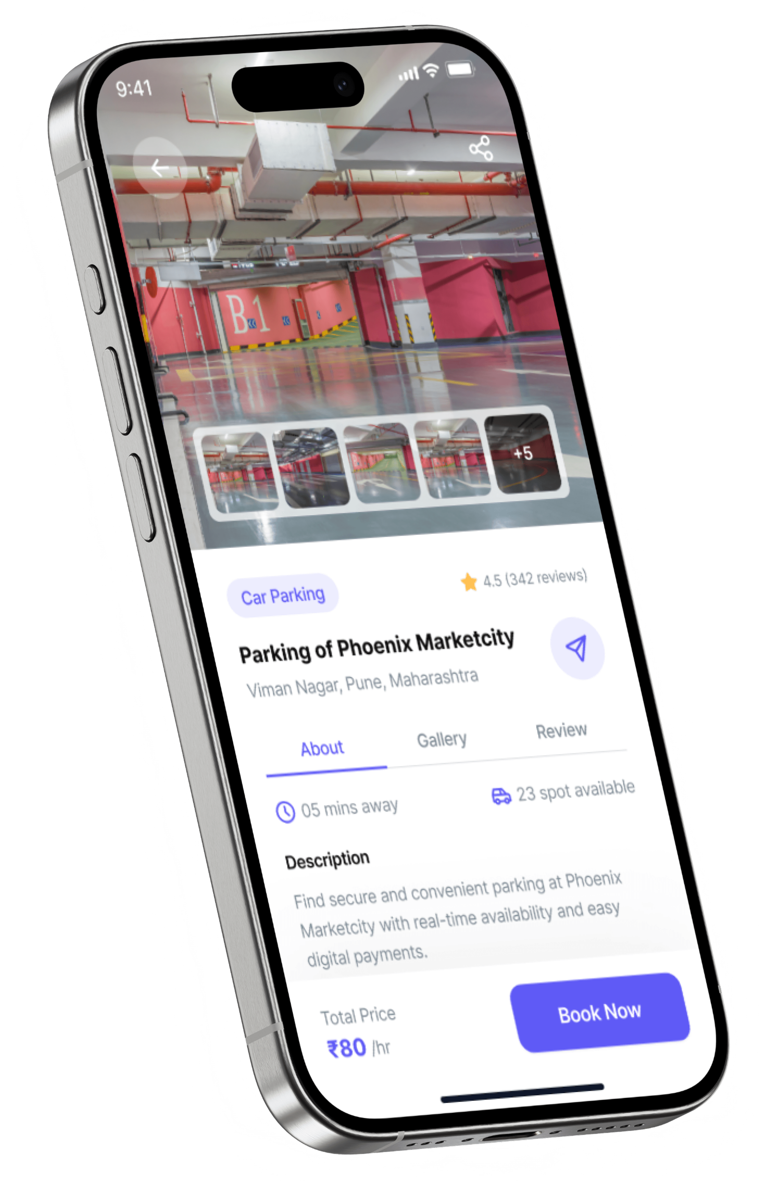
Help users find available spot faster by surfacing clear, real-time availability and filters that match their needs.

Reduced average parking search time by 40% through a prototype that surfaced real-time availability and smart filters.
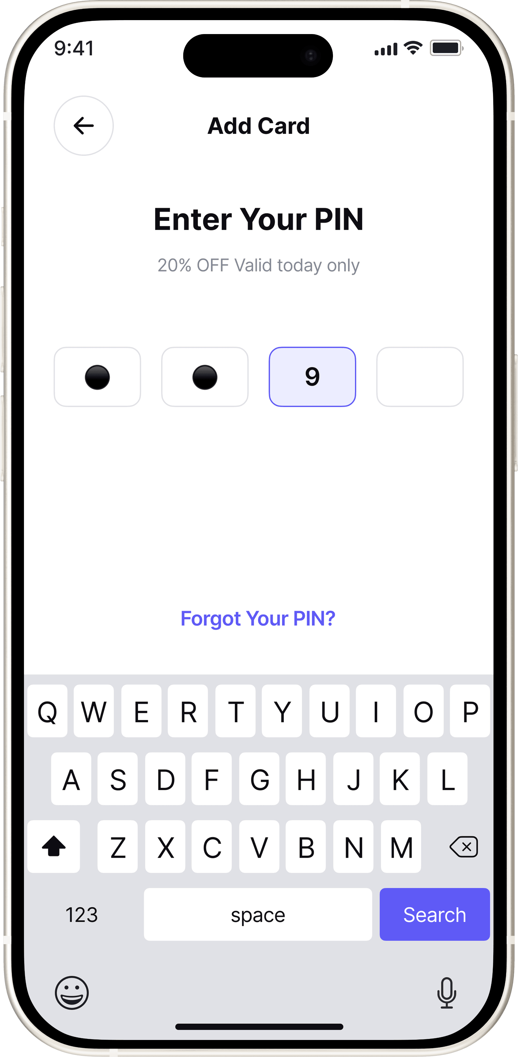
#DESIGN INSIGHT

Familiarity Breeds Trust

Users spend 40% less time choosing when key data and recognizable cues are visible upfront.

Showing price, distance, and spot count upfront helps users compare instantly.

#DESIGN INSIGHT

Familiarity Breeds Trust

Users spend 40% less time choosing when key data and recognizable cues are visible upfront.

Showing price, distance, and spot count upfront helps users compare instantly.

#UX TIP

Predictive Convenience

This aligns with Hick's Law, where fewer visible choices speed up decision-making.

Entering arrival and exit times personalizes results instantly, reducing decision fatigue and showing users relevant parking options right away.

#UX TIP

Predictive Convenience

This aligns with Hick's Law, where fewer visible choices speed up decision-making.

Entering arrival and exit times personalizes results instantly, reducing decision fatigue and showing users relevant parking options right away.

#UX TIP

Visual Spatial Cues

Users process spatial layouts 60% faster than text-based lists.

A live map builds spatial memory and visual cues, guiding users to nearby, available spots without scanning long lists.

#UX TIP

Visual Spatial Cues

Users process spatial layouts 60% faster than text-based lists.

A live map builds spatial memory and visual cues, guiding users to nearby, available spots without scanning long lists.

#2 Payment Inconvenience

#2 Payment Inconvenience

"Maps gets me to the street, not the entry gate.”

“After booking I’m still unsure which lane/row is mine."

Office Comuter

"Maps gets me to the street, not the entry gate.”

“After booking I’m still unsure which lane/row is mine."

Office Comuter

Design Objective

Enable secure, one-tap payments with instant confirmation.

35% reduce checkout time and 100% task completion in tests.

#Design Insight

Choice Builds Trust

Higher conversion rate due to user trust in known systems.

Displaying multiple familiar payment methods (Paytm, Google Pay, UPI, Card) increases user trust and reduces drop-offs during checkout.

#Design Insight

Choice Builds Trust

Higher conversion rate due to user trust in known systems.

Displaying multiple familiar payment methods (Paytm, Google Pay, UPI, Card) increases user trust and reduces drop-offs during checkout.

#DESIGN INSIGHT

Feedback Builds Assurance

30% increase in user confidence after payment completion.

From PIN entry to the success screen, clear visual cues (lock icons, checkmarks) provide immediate feedback and reinforce a sense of security.

#DESIGN INSIGHT

Feedback Builds Assurance

30% increase in user confidence after payment completion.

From PIN entry to the success screen, clear visual cues (lock icons, checkmarks) provide immediate feedback and reinforce a sense of security.

#3 Lack of Transparency

#3 Lack of Transparency

"I wish I knew things like CCTV or lighting before I book."

"Switching between apps for PayTM or GPay is annoying."

Daily Commuter

Design Objective

Help users make confident choices by displaying lot transparency details upfront.

Users could easily compare verified lots with visible safety details like CCTV and lighting, making booking decisions faster and more confident in the prototype.

#4 Poor Navigation

#4 Poor Navigation

"Maps gets me to the street, not the entry gate.”

“After booking I’m still unsure which lane/row is mine."

Office Comuter

"Maps gets me to the street, not the entry gate.”

“After booking I’m still unsure which lane/row is mine."

Office Comuter

Design Objective

Guide users end-to-end: from their location to the gate, then to the exact slot.

User Satisfaction score: 4.6/5 for navigation experience

#Design Insight

Guided Movement Reduces Confusion

Users reached their slot approx 60% faster during testing simulations

The dynamic arrow system minimizes cognitive load, offering a continuous, step-by-step route until arrival.

#Design Insight

Guided Movement Reduces Confusion

Users reached their slot approx 60% faster during testing simulations

The dynamic arrow system minimizes cognitive load, offering a continuous, step-by-step route until arrival.

#DESIGN INSIGHT

Closure Builds Confidence

Reported feeling "Sure I parked in the right spot"

The arrival confirmation screen provides closure the moment users reach their slot.

#DESIGN INSIGHT

Closure Builds Confidence

Reported feeling "Sure I parked in the right spot"

The arrival confirmation screen provides closure the moment users reach their slot.

#5 Forgotten Parking Location

#5 Forgotten Parking Location

"Every time I park in a big mall, I forget which floor I left my car on."

Commuter visiting mall

Design Objective

Help users recall their exact parking location through smart tagging and visual cues, eliminating confusion and wasted time.

Reduces post-parking confusion by helping users recall and navigate to their exact slot instantly.

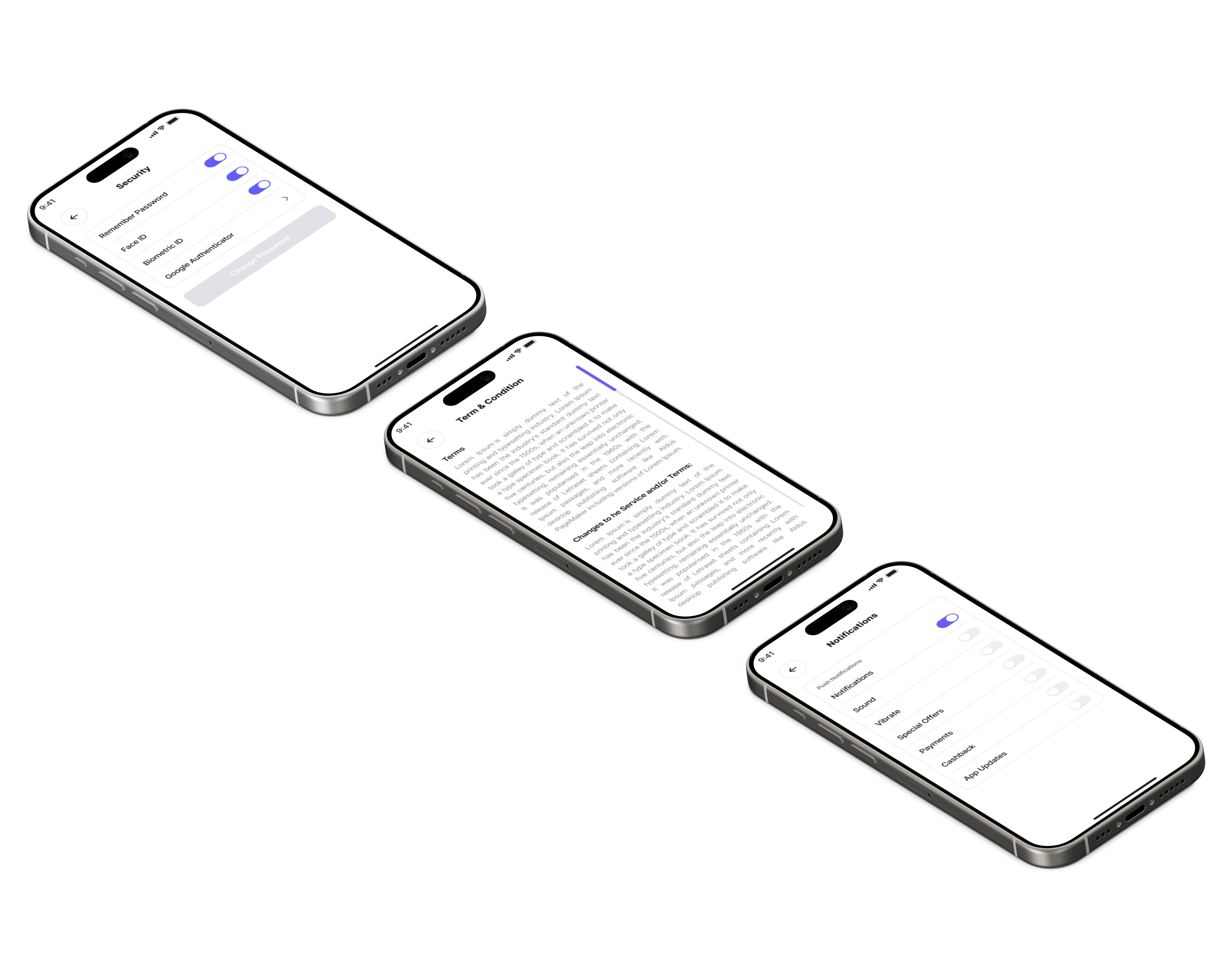
Account Setting Screens

How this project strengthened my thinking as a Product Designer

How this project strengthened my thinking as a Product Designer

Beyond Designing

I learned that great UX goes far beyond pixels. Collaborating around hardware limitations (like scanners and gates) taught me how to design systems, not just screens.

Beyond Designing

I learned that great UX goes far beyond pixels. Collaborating around hardware limitations (like scanners and gates) taught me how to design systems, not just screens.

Balancing Simplicity

Users wanted speed and confidence, they needed pricing, spot count, and safety upfront. This helped me design interfaces that feel fast but still informative.

Balancing Simplicity

Users wanted speed and confidence, they needed pricing, spot count, and safety upfront. This helped me design interfaces that feel fast but still informative.

Real-world Contexts

GPS dropped underground, and users lost orientation. Testing revealed that fallback visuals and manual slot confirmation were more effective than tech-heavy solutions.

Real-world Contexts

GPS dropped underground, and users lost orientation. Testing revealed that fallback visuals and manual slot confirmation were more effective than tech-heavy solutions.

Made with ❤️ & coffee by © Dhawal.

Create a free website with Framer, the website builder loved by startups, designers and agencies.